Button Themes
!!! tip "Pro feature" Button themes require RemoteX Pro. The free tier is locked to the Bold theme.
Button themes change the visual style of every tile in the grid. Select a theme from Preferences → Button Appearance → Button theme.
Available themes
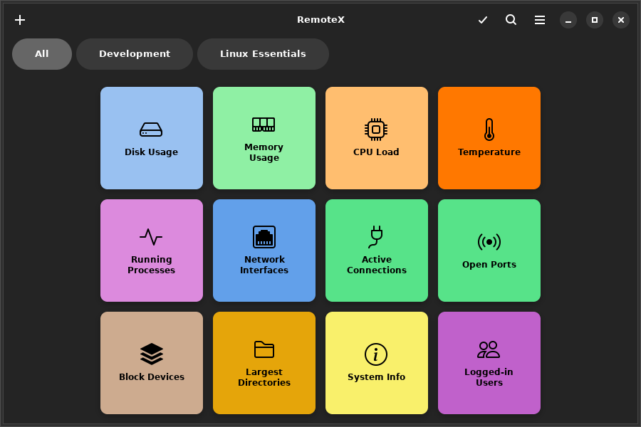
Bold (default)
Solid colored tiles with strong contrast. This is the system default — tiles use the Adwaita card style with your per-button background color applied as a flat fill. Works well in both light and dark mode.
Phone
Compact flat tiles with minimal padding, reminiscent of a phone dialer or calculator. Works best with small or medium button size and a higher column count.
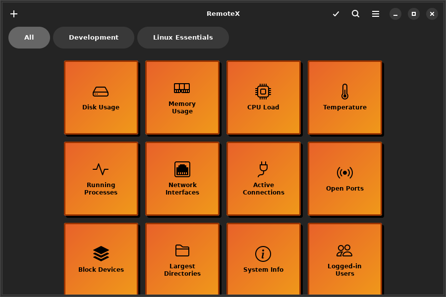
Neon
Dark background with glowing accent borders that pulse on hover. Per-button colors become the glow color. Designed for dark mode — looks best when your desktop is set to dark.
!!! note The Neon theme's glow effect is a hover animation — it is best appreciated at runtime. Move the mouse over a button to see the glowing border.
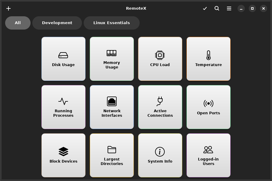
Retro
Terminal-inspired monochrome style with a scanline texture. Forces a dark background with green or amber text. Ignores per-button colors — all tiles look the same intentionally.
Custom CSS
!!! tip "Pro feature" Custom CSS requires RemoteX Pro.
For full visual control, load your own .css file. Set the path in Preferences → Button Appearance → Custom CSS file → Browse.
When a custom CSS file is loaded, it is applied on top of the selected theme. You can combine a base theme with small CSS overrides, or write a complete theme from scratch.
Available CSS targets
/* The tile container */
.button-tile {
  background: #1e1e2e;
  border-radius: 12px;
  border: 2px solid rgba(255, 255, 255, 0.15);
}

/* Hover state */
.button-tile:hover {
  box-shadow: 0 0 16px rgba(137, 180, 250, 0.5);
}

/* Active / pressed state */
.button-tile:active {
  transform: scale(0.97);
}

/* The label text */
.button-tile .tile-label {
  color: #cdd6f4;
  font-weight: bold;
  font-size: 0.85rem;
}

/* Running state (command is executing) */
.button-tile.running {
  opacity: 0.6;
}

/* Success flash */
.button-tile.success {
  border-color: #a6e3a1;
}

/* Failure flash */
.button-tile.error {
  border-color: #f38ba8;
}
Click Export template in Preferences to download a starter file containing all available selectors with their default values commented out.
!!! note
GTK4 CSS does not support max-width or max-height. Use widget halign/valign instead. Percentage-based sizing also has limited support — pixel values are more reliable.